


Read, Look, and Play:
Hangul Typography History and Education
2021-2022
Senior Thesis
Senior Thesis
148 mm × 235.4 mm | 5.8268" × 9.2677"
Dull paper, neon color paper, lenticular sheets, and neon color threads
Read, Look, and Play: Hangul Typography History and Education discusses the origin of Hangul typography, its characteristics, and how the typography was developed by designers in the late 20th century. Hangul is differently structured that initial consonants and vowels assemble to make letters. However, designers like Ahn, Sangsoo tried to explore further by deconstructing alphabets. After understanding Hangul construction, the thesis explores how Hangul typography was applied to different mediums from the 1960s. The case study examines Korean design students’ work because the current design students are the future of Korean design. It criticizes that the result-oriented society focusing on success and commercials led the education to also focus on the grades that many students do not try for challenges. Lastly, the thesis includes interviews with Pyun, Seok-Hoon and Ahn, Sangsoo, who share similar but different ideas about Hangul typography and education. The status quo in education has limitations, but there is a possibility that young design students will break the bad customs and change the future. The education institutions and the government should support the young design students to learn and experiment more with Hangul design, who will share the beauty of Hangul and Korean culture through design.
For the overall color palette, I chose Pantone neon colors: 802C and 806C. By using these colors, I wanted to deliver my opinion that Hangul typography can be more experimented with by young designers. Then I chose to use lenticular sheets for the covers to show the optical illusion between Hangul and Roman alphabets. They can be used together to look like a letter or a word, whether it makes sense or not. Then the book was bounded in two steps, first as saddle-stitch binding, and then as kettle stitch binding, using neon color threads.
For the overall color palette, I chose Pantone neon colors: 802C and 806C. By using these colors, I wanted to deliver my opinion that Hangul typography can be more experimented with by young designers. Then I chose to use lenticular sheets for the covers to show the optical illusion between Hangul and Roman alphabets. They can be used together to look like a letter or a word, whether it makes sense or not. Then the book was bounded in two steps, first as saddle-stitch binding, and then as kettle stitch binding, using neon color threads.
Check my thesis featured on Corcoran NeXT website and on Corcoran Instagram.
Book


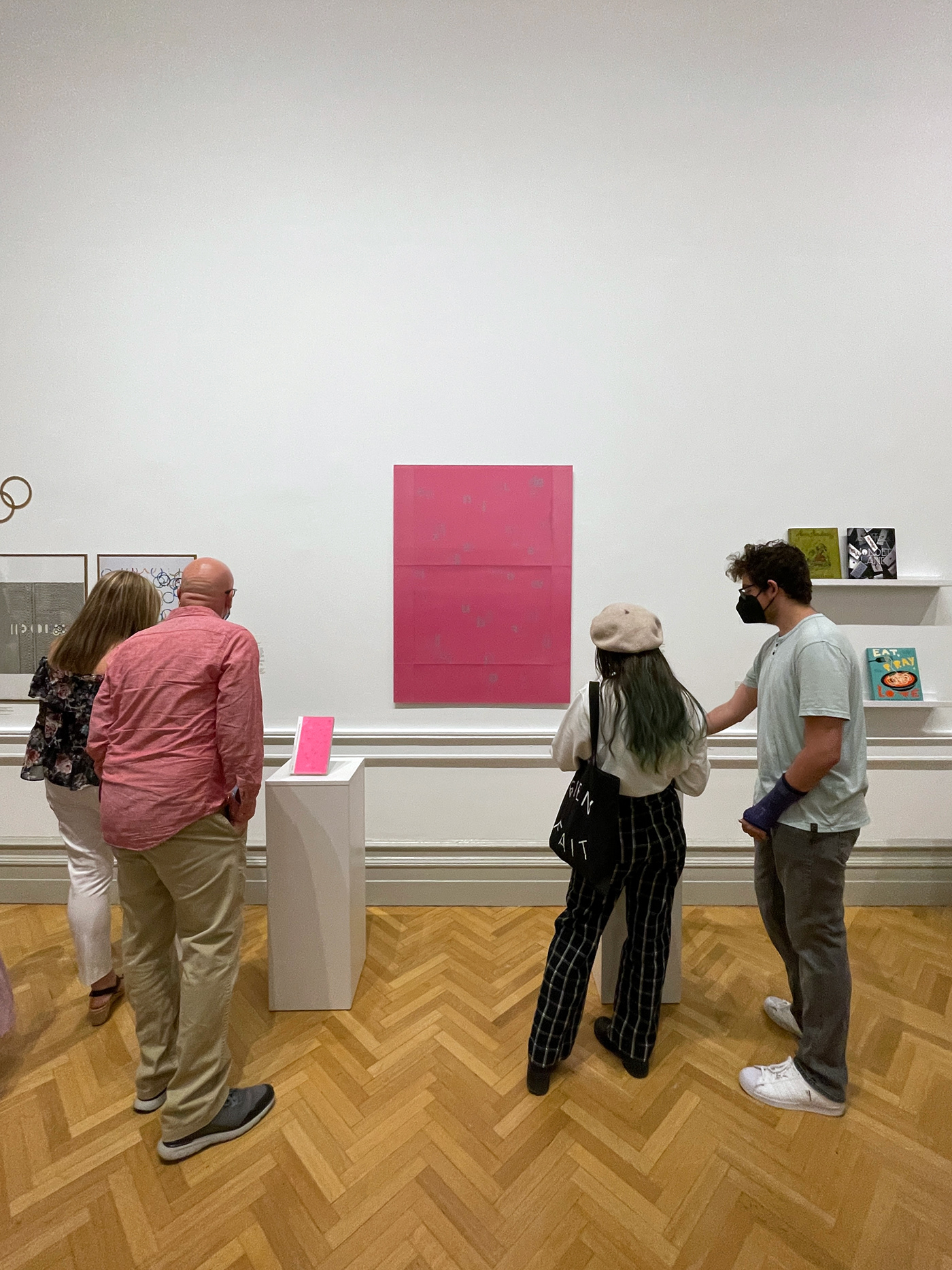
Exhibition


Photo: Denny Henry @djhfoto


Photo: Denny Henry @djhfoto
NeXT 2022 Opening Night
Corcoran School of Arts and Design
April 28, 2022
Corcoran School of Arts and Design
April 28, 2022
Progress

March 30, 2022 | Book binding mock up


April 2, 2022 | Print proof check
I initially wanted to use off-set printing, but lots of printing presses cannot do small quantity off-set printing. Therefore, I had to choose digital printing, while keeping the vibrant effect that I wanted by using the neon colors.
I initially wanted to use off-set printing, but lots of printing presses cannot do small quantity off-set printing. Therefore, I had to choose digital printing, while keeping the vibrant effect that I wanted by using the neon colors.


April 8, 2022 | Book binding
I first stapled books into sections, make neon color threads go through each staple, and then glued the spine so the book does not break when it is fully open.
I first stapled books into sections, make neon color threads go through each staple, and then glued the spine so the book does not break when it is fully open.


April 5, 2022 | Poster #1
The first try of applying the lenticular sheets on the poster did not work out.
The first try of applying the lenticular sheets on the poster did not work out.


April 8, 2022 | Poster #2
I had to re-print posters and decide which one will work better. If I choose the pink background with grey alphabets, I could use the lenticular sheets. However, if I choose the second option using both pink and green, I could not use the lenticular effect. The second option has a white background with very thin lines. I had to decide based on what I wanted to show to the audience.
I had to re-print posters and decide which one will work better. If I choose the pink background with grey alphabets, I could use the lenticular sheets. However, if I choose the second option using both pink and green, I could not use the lenticular effect. The second option has a white background with very thin lines. I had to decide based on what I wanted to show to the audience.


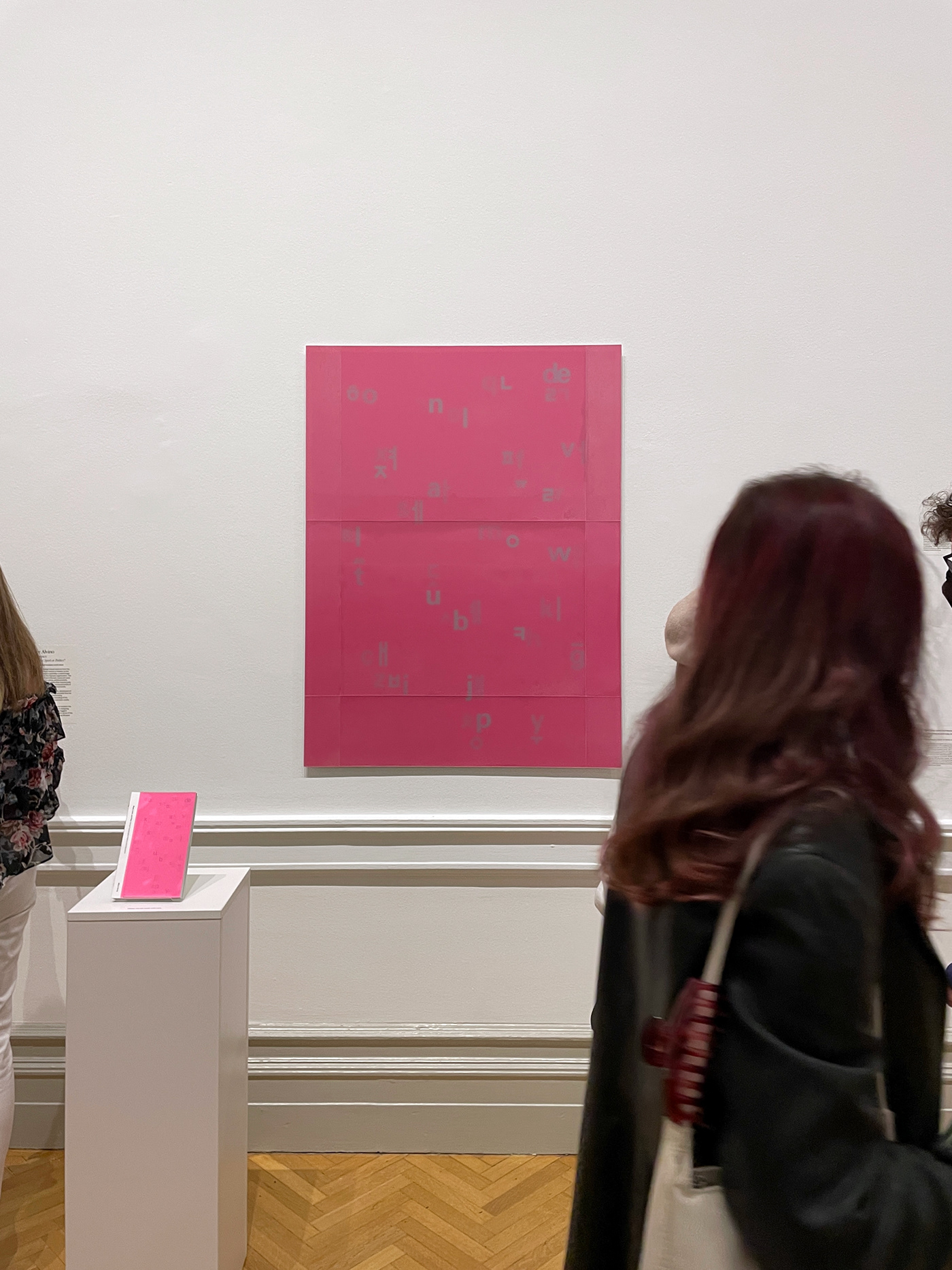
April 12, 2022 | Final poster
I decided to go with the original idea because I can use the lenticular sheets. Some may say that the lines are disturbing, but a 28" x 20" size lenticular sheet was the largest option I could get. Therefore, I tried to fit the design within 28 inches in the center.
I decided to go with the original idea because I can use the lenticular sheets. Some may say that the lines are disturbing, but a 28" x 20" size lenticular sheet was the largest option I could get. Therefore, I tried to fit the design within 28 inches in the center.


